
A rebrand that evolved 60 years of architectural practice into a contemporary identity, built through a modular visual system and a digital platform designed for clarity, depth, and long-term use.
Adero Architecture is the new name and identity for a long-established Saskatchewan practice, formerly Henry Downing Architects. With over 60 years of work behind it, the firm had deep credibility in-market, built through steady delivery and long-term client relationships.
The challenge was not to reinvent that trust. It was to align the public-facing identity with the quality of the work and the culture behind it, and to introduce the new name with clarity across every touchpoint.
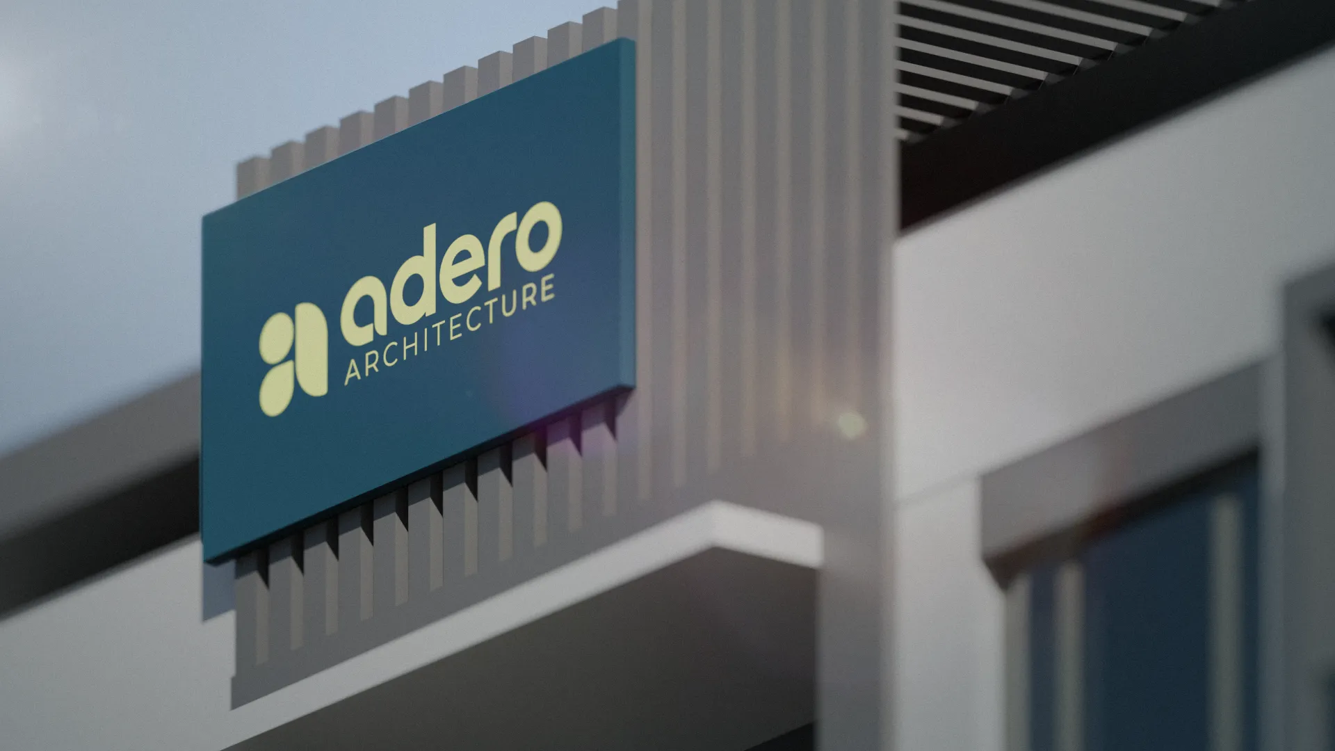
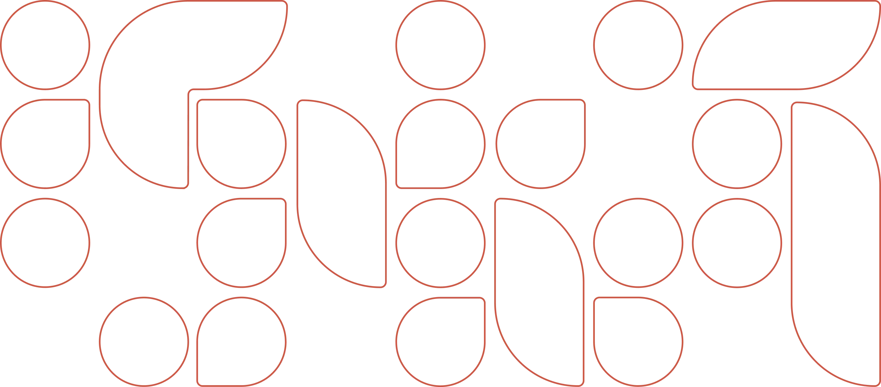
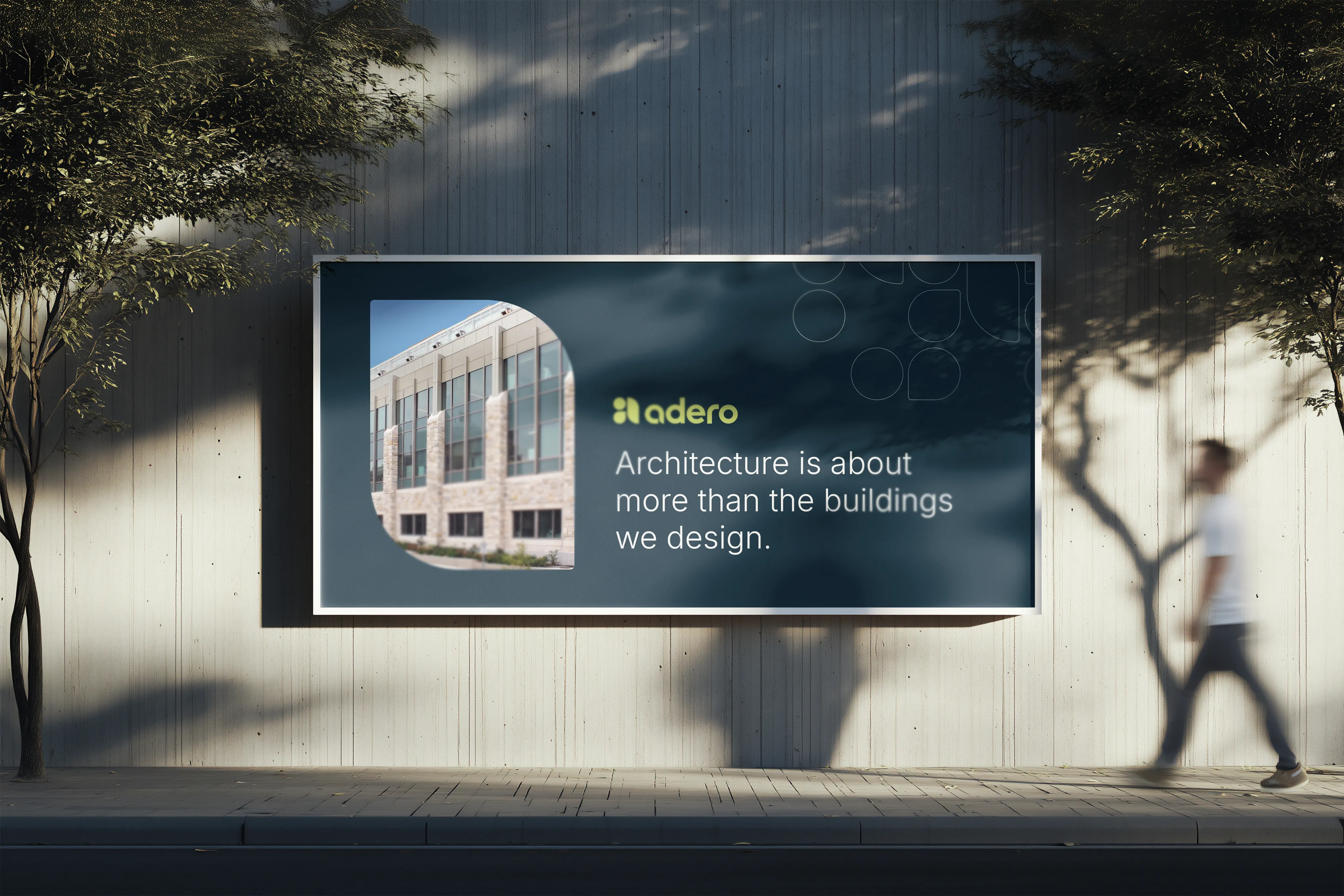
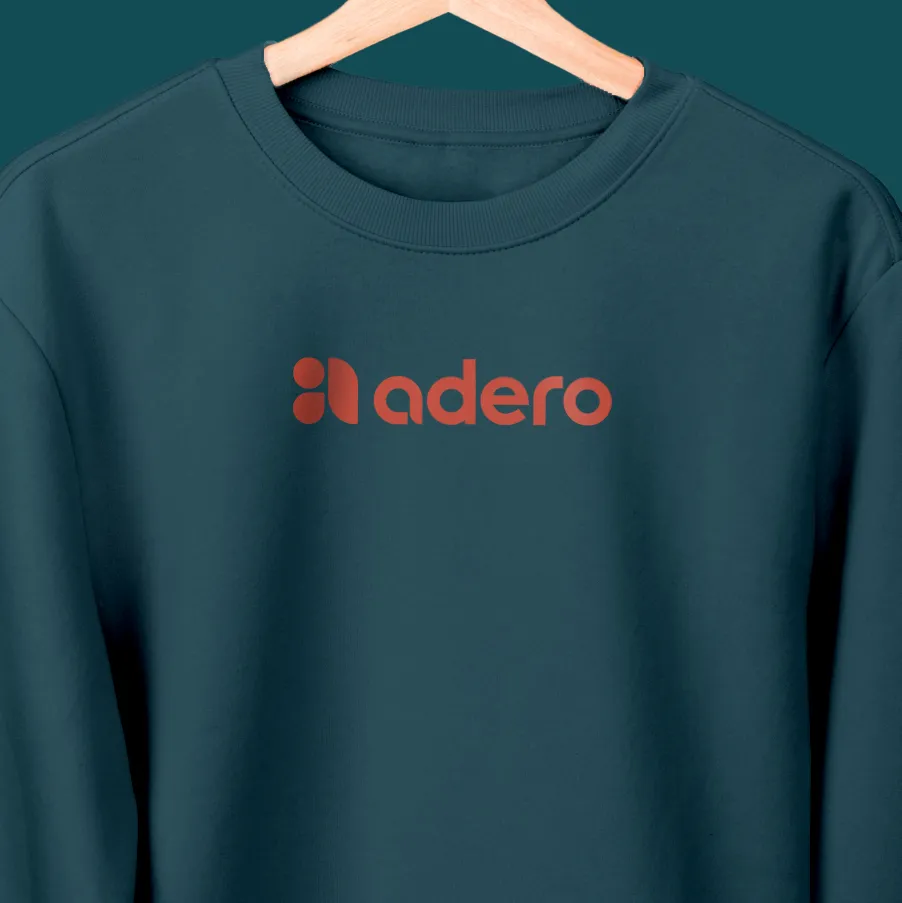
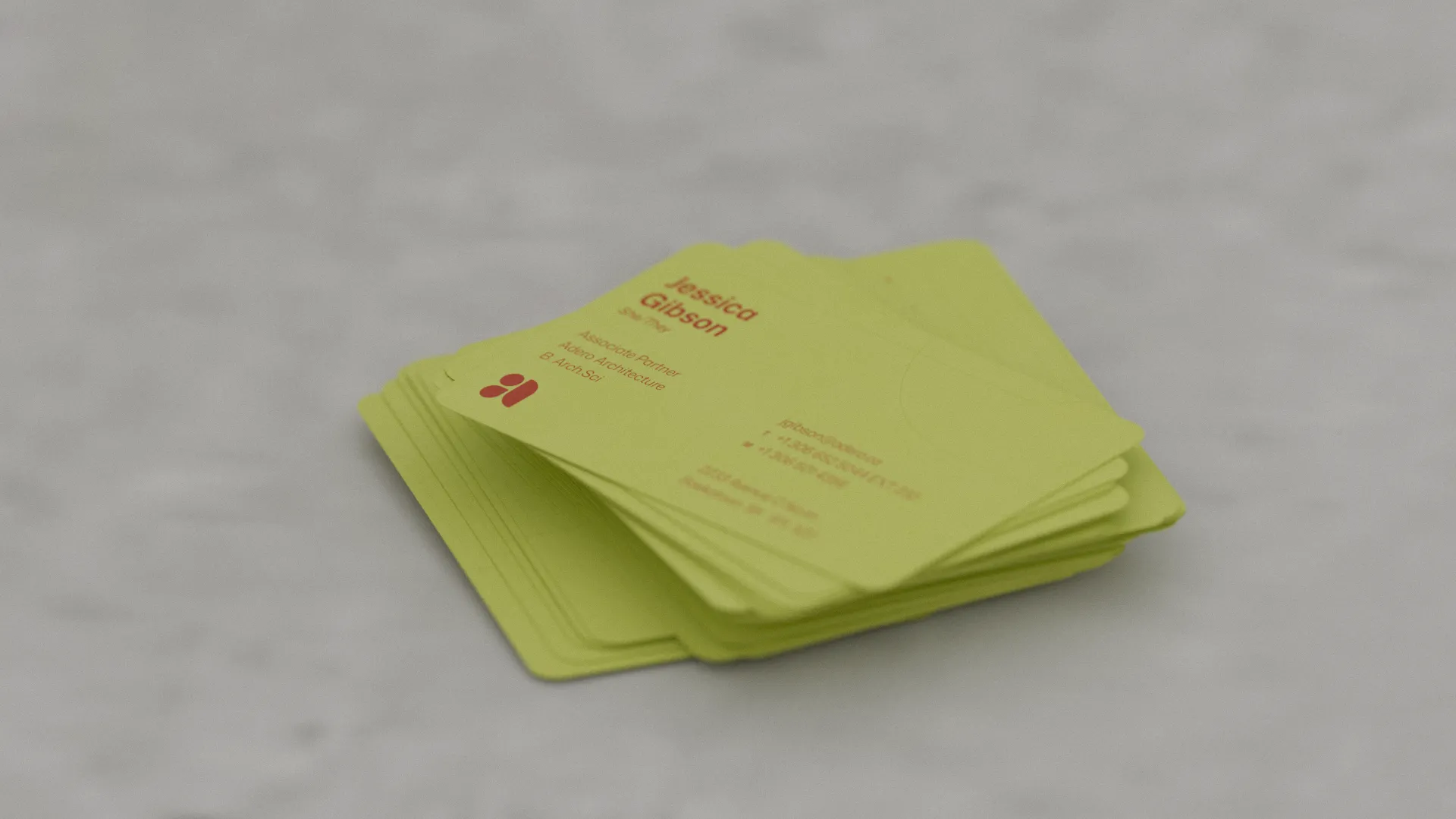
We designed the brand and the website as one connected system. The identity starts with a small vocabulary of forms that can do real work across applications. A circle that signals unity and connection. A pointer that draws focus inward and represents purpose and precision. A pillar that stands for strength, care, and support from initial vision to final form. Built this way, the mark is not a single precious symbol. It is a set of parts with rules, so it can scale, repeat, and stay recognizable on everything from a sign to a proposal cover.
The supporting language was built to feel calm, contemporary, and human. Mona Sans anchors the typography with clarity and range. Midnight provides a grounded base, with Mint and Citrus adding contrast and lift when the brand needs energy. Patterning extends the identity quietly, derived from the same curving geometry, used more like a material layer than a graphic flourish. Photography guidance keeps the work honest and optimistic, with clean lines, clear focal points, and candid moments that feel purposeful rather than posed.
The website carries the same logic. It is designed for scanning and for depth. Projects lead with a clear summary and then open into detail, with navigation that makes it easy to move between work, team, and news without losing your place. The visual system is spacious and restrained, built from modular components so content can evolve without redesigning the experience each time. Under the hood, the site was designed for speed and maintainability, using a lightweight build approach and a CMS that gives the team direct control over Projects, Team bios, and News updates.
What emerged is a durable system for presenting the practice. One that makes the new name feel established across everyday touchpoints, and a digital home that communicates the work with clarity while staying easy to operate day to day.
Not sure where to start? Tell us a bit about yourself and your product or project. With over 30 years of experience, we’ve seen it all. No matter what stage you’re in, we’ll find a way to help or guide you to someone who can.
Contact arrow_forward arrow_forward Book Meeting arrow_outward arrow_outward