


A brand and digital platform that brought maternal and child health information across Saskatchewan into one trusted system. Designed for families who need clarity in moments that matter, built through empathy and province-wide engagement.
Moms & Kids Health Saskatchewan is a provincial portfolio within the Saskatchewan Health Authority, supporting people through pregnancy, birth, newborn care, and child health across Saskatchewan. The work landed at a moment when the system around families was changing quickly. A new children’s hospital was coming online in Saskatoon, while the province was also consolidating multiple regional health authorities into one. Information that used to live in many regional sites needed to become one dependable destination.
The tension was scale versus vulnerability. The experience had to carry the authority of a provincial health system while meeting people in a heightened emotional state. It also needed an identity that could stand on its own while fitting within two larger ecosystems: Saskatchewan Health Authority as the parent brand, and Jim Pattison Children’s Hospital as the public anchor for pediatric care.
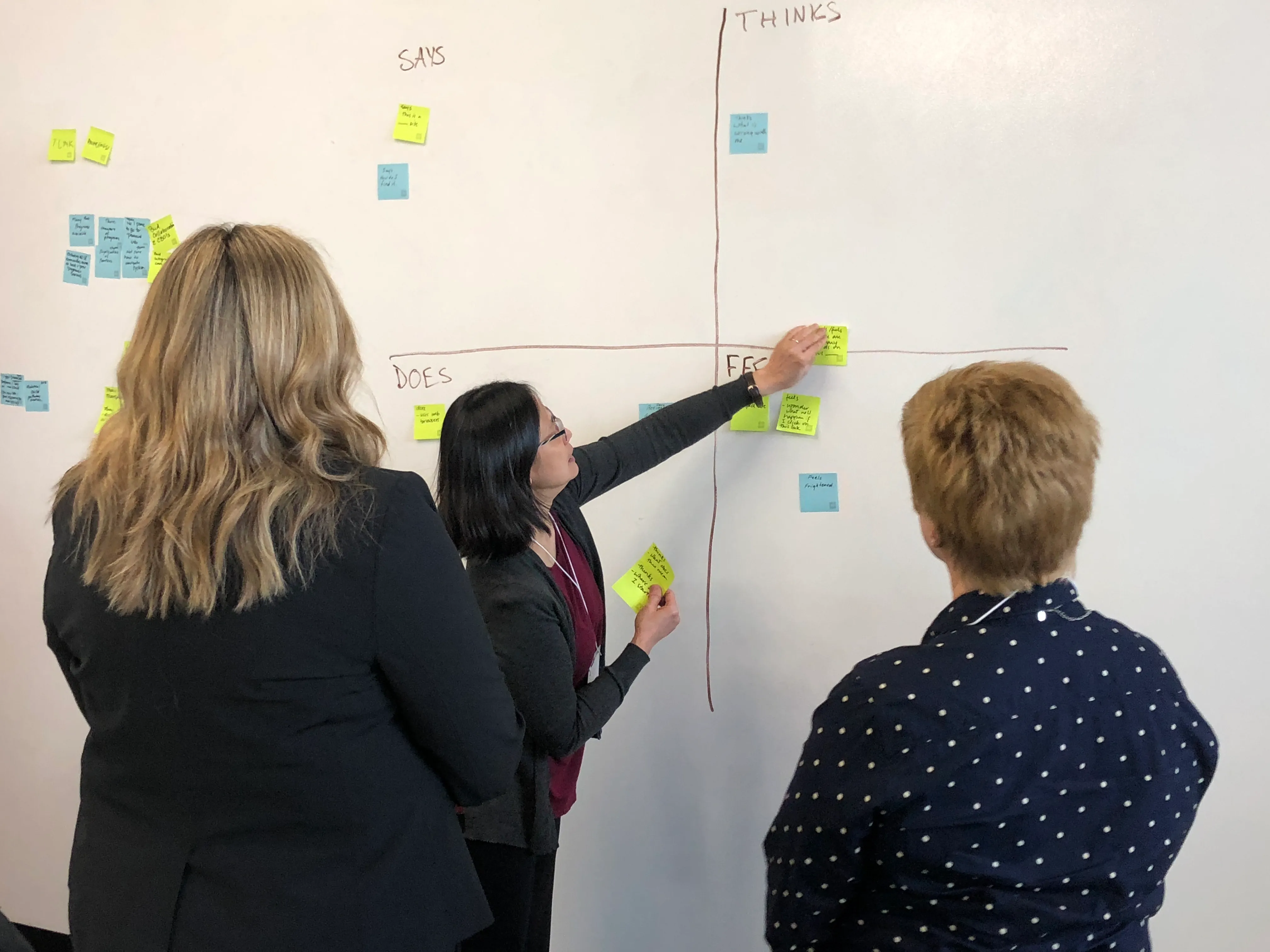
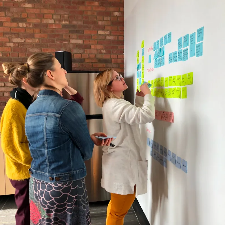
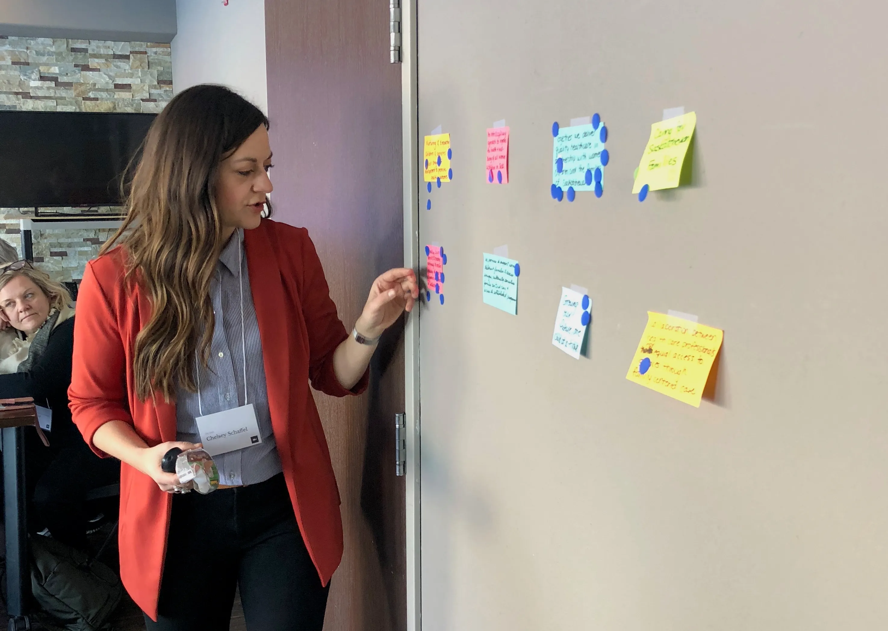
We designed the brand and the digital experience as one effort to make the system easier to navigate and easier to trust. Empathy first, information second. That meant building structure and language for people who do not have the time or energy to decode how healthcare organizes itself.
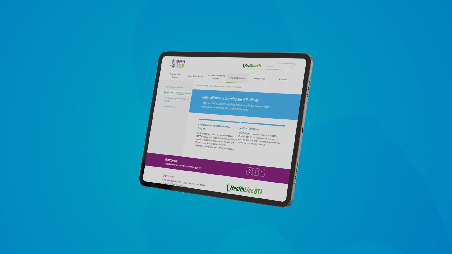
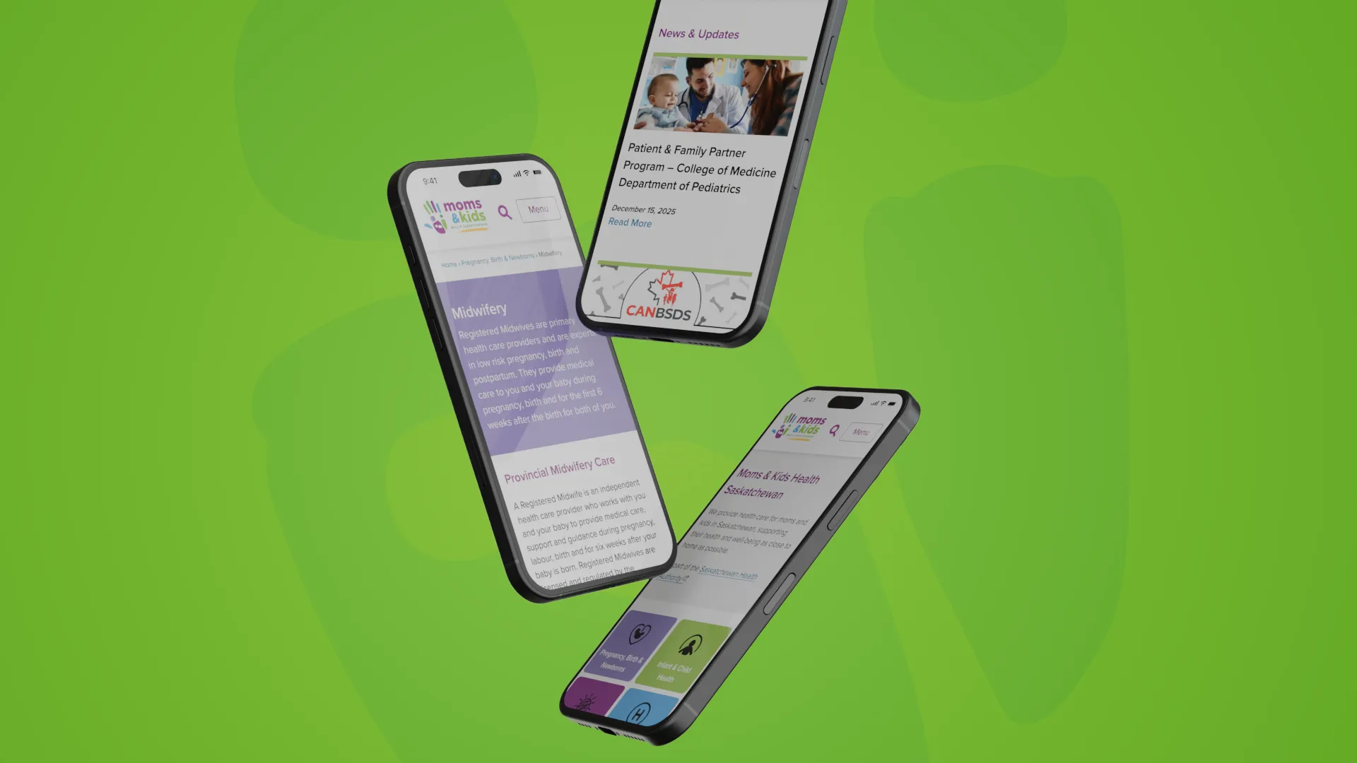
The most consequential shift was structural. We moved away from internal medical taxonomy and toward how families actually look for help. By life stage and by questions. Navigation centered on journeys like pregnancy, birth and newborns, and infant and child health. When users do not know which specialty treats what, a condition-based lookup bridges everyday language and clinical pathways. A facility finder makes local options visible, reducing unnecessary travel and the sense that care only exists in one city.
Content drove the experience. Writing is built for scanning, with conclusions first and details last, and grade-level targets that keep guidance accessible under stress. Governance made it sustainable. Subject matter experts provide the facts, while content leads translate those facts into consistent web content that can be maintained over time.
Visually, the identity needed to feel welcoming without losing authority. The handprint became the anchor, a human signal inside a large system. Colour stays locally grounded. Small rules carry real weight in daily use, from an ampersand-based clear zone to avoiding a single-tone green logo that would blend into the SHA brand.
What emerged is a public-facing system designed for real conditions. A platform that helps a parent start with a question and still end up in the right place, without learning the bureaucracy first.
Not sure where to start? Tell us a bit about yourself and your product or project. With over 30 years of experience, we’ve seen it all. No matter what stage you’re in, we’ll find a way to help or guide you to someone who can.
Contact arrow_forward arrow_forward Book Meeting arrow_outward arrow_outward